Why Colour Is the Thing Most People Get Wrong
Most fits don’t fail because of the pieces. They fail because of the colours. You can own great hoodies and clean joggers, yet still look off if the shades fight each other. I’ve made this mistake plenty, so I know the feeling. You throw on a bright top, a loud bottom, and a jacket in a third clashing tone, then wonder why the whole thing looks messy. The fix is simpler than you’d think. Colour is the quiet engine behind every good outfit, and once you understand it, everything clicks. You don’t need a fashion degree or a colour wheel taped to your wall. You just need a small set of shades that agree with each other. Pick those, build around them, and your fits start looking intentional overnight. So before you buy another piece, think about colour first and the item second. That order matters more than people realise. A plain hoodie in the right shade beats a flashy one in the wrong tone every single time. Get the colour story right, and even simple pieces start looking sharp. That’s the whole secret, and it costs nothing to learn.
Start With a Tight Base of Neutrals
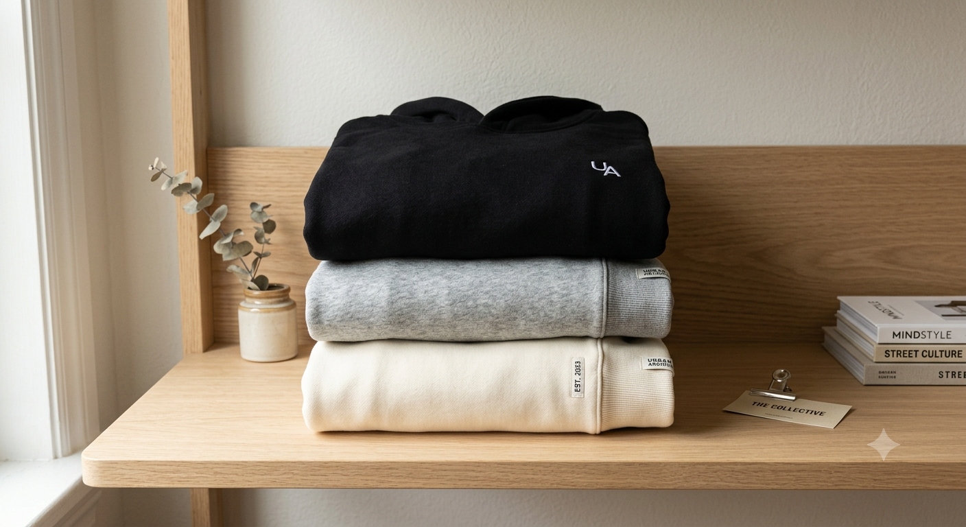
Every strong wardrobe sits on a base of neutral colours. Black, grey, white, cream, and navy do the heavy lifting, because they pair with almost anything. So your first few pieces should live in this range, full stop. I tell every beginner the same thing: buy boring before you buy bold. A neutral base gives you a backbone, and bolder pieces only look good when they’ve got something calm to sit against,there’s a hands-on detail worth knowing: grey is the most flexible shade in streetwear, because it bridges warm and cool tones without clashing. A grey hoodie works under a black jacket, over white trousers, or beside a cream layer. That flexibility makes it the smartest first buy. Don’t rush into colour yet. Lock your neutrals first, wear them for a few weeks, and notice how easily they mix. Then you’ll see exactly where a pop of colour fits. Building this way feels slow, but it saves you from a drawer full of pieces that don’t talk to each other. Neutrals are the foundation. Get them right, and everything you add later has somewhere safe to land.
The Simple Colour Rules That Always Work
You don’t need complicated theory. Just a few rules that hold up in real life. Follow these and your fits will look balanced almost every time.
- Stick to two or three colours per outfit. More than that and the look gets noisy fast.
- Let one colour lead. Pick a dominant shade for most of the fit, then use the others as accents.
- Match your metals and tones. Keep warm shades with warm, cool with cool, and your outfit feels deliberate.
- Use black or grey to break up loud pieces. A neutral between two bold colours calms the whole thing down.
- Repeat a colour twice. If your cap matches your shoes, the fit instantly looks planned.
Write these somewhere you’ll remember them. They sound basic, but most people break all five without noticing. Follow them and you’ll dress better than half the people chasing trends, because you’re working with colour instead of against it.
Adding Your First Bold Colour
Once your neutrals are locked, you’ve earned the right to add some colour. This is the fun part, but it’s also where people overdo it. So go slow. Start with one bold piece, not three. A single trapstar uk hoodie in a colour like deep blue or burgundy adds personality without taking over, because the rest of your fit stays neutral and grounds it. The trick is balance. One loud piece against calm neutrals looks intentional, while three loud pieces together look chaotic. I personally love a bold top with plain black bottoms, because the colour gets all the attention and nothing competes with it. Pick a shade you actually like, not just one that’s trending, since you’ll wear it far more if it feels like you. Darker bolds like forest green, navy, and burgundy are easier to style than bright neons, so they make a safer first step. Wear your new colour a few times and see how it fits your existing pieces. If it pairs easily, you chose well. Add colour one piece at a time, and your wardrobe grows without ever tipping into a mess.
Colours to Be Careful With
Some colours look great on the rack but cause problems in real outfits. So keep these in mind before you buy on impulse.
- Bright neons. They grab attention but clash with almost everything, so they’re hard to wear more than once a week.
- Pure white bottoms. They show every mark and limit how you can pair them, so think twice.
- Too many earth tones at once. Brown, tan, and olive together can look muddy without a neutral to break them up.
- Trend-only shades. A colour that’s hot this season may date fast, so don’t build your base around it.
- Matching head-to-toe in one bold colour. It reads as a costume more than an outfit unless done very carefully.
One honest limitation: colour on a screen rarely matches the real thing exactly, because every display shows shades a little differently. So when a specific tone matters to you, ask the shop for extra photos before ordering. That small step saves you from a colour that looked perfect online but feels wrong in your hands.
Building a Calm Premium Palette
If you want a more grown-up, premium look, the answer is fewer colours, not more. The cleanest wardrobes lean heavily on muted, tonal shades that sit close together. A cole buxton hoodie in washed grey, off-white, or deep navy brings that quiet premium feel, because muted tones read as considered rather than loud. So instead of chasing bright statement pieces, build a palette where everything whispers. Tonal dressing, where you wear different shades of the same colour family, is the easiest way to look expensive on a budget. Think cream over beige, or charcoal over light grey. These combinations feel intentional and calm. I’ve found that the more I strip colour out of my wardrobe, the sharper my fits look, which surprised me at first. Premium isn’t about flashy colours. It’s about restraint and tones that agree. Pick a narrow range, stick to it, and let fit and fabric do the talking instead of colour. This approach also makes getting dressed easier, since almost everything matches by default. A calm palette is the quiet path to looking put together every single day.
Matching Across Different Brands
You don’t have to buy everything from one shop to keep your colours consistent. In fact, the best wardrobes mix brands freely. The key is matching by tone, not by label. A black hoodie from one shop and a noneofus piece in a similar shade will sit together fine, as long as the colours agree. So when you shop across brands, keep your palette in mind and only add pieces that fit it. This is where having a tight colour range pays off, because it acts like a filter for every purchase. If a piece doesn’t fit your shades, you skip it, no matter how nice it looks alone. I learned this the slow way, after buying great pieces that never matched anything I owned. Now I treat my palette like a rulebook. One warning: shades of the same colour can vary between brands, so a “black” from one shop might lean slightly grey or blue. Check photos carefully and, when it matters, ask. Match by tone, shop across brands, and your wardrobe stays coherent no matter where each piece came from.
Letting Your Palette Grow With You
Your colour story isn’t fixed forever. It should grow as your taste does. So don’t feel locked into the shades you started with. Once your neutrals and first bold pieces feel comfortable, you can slowly widen the range. Add a second accent colour, try a new tonal family, or experiment with a shade you’ve been eyeing. The point is to grow on purpose, not by accident. I’ve shifted my own palette over the years, moving from heavy black toward more greys and creams, and it happened gradually as I figured out what I actually liked. Pay attention to which pieces you reach for most, because those tell you your real preferences. Build more around those shades, and quietly retire the ones you never wear. Your wardrobe should reflect you, not a trend or a guide. So use these rules as a starting frame, then bend them as your eye sharpens. The goal isn’t a perfect formula. It’s a set of colours that feel natural to wear, mix easily, and look like you on purpose. Get there slowly, and your style starts to feel effortless.
Final Words
Colour is the quiet thing that makes or breaks a fit. Start with a tight base of neutrals, add bold shades one at a time, and match by tone instead of label. Keep your palette narrow, repeat colours to look planned, and let the range grow as your taste does. Do this, and even simple pieces start looking sharp. You’ll spend less, mix more, and finally feel like your colours work for you instead of against you. That’s the whole game, and now you’ve got the plan.